Read on: My website
Read time: 2 Minutes
You spent hours creating that presentation.
Days writing that white paper.
Weeks refining that SOP.
But here's the problem: Most people won't read it.
They'll skim. They'll bookmark it "for later." They'll move on.
Unless you give them something they can see and process in 10 seconds.
That's where infographics come in. And now, Google's NotebookLM lets you turn any content (i.e., presentation, podcasts, YouTube videos, PDFs, meeting transcripts, even testimonials) into professional-grade infographics.
For free.
No design skills. No Canva subscription. No excuses.
Did I mention for free?
Let’s dance.
Was this newsletter forwarded to you?
The Future of Shopping? AI + Actual Humans.
AI has changed how consumers shop by speeding up research. But one thing hasn’t changed: shoppers still trust people more than AI.
Levanta’s new Affiliate 3.0 Consumer Report reveals a major shift in how shoppers blend AI tools with human influence. Consumers use AI to explore options, but when it comes time to buy, they still turn to creators, communities, and real experiences to validate their decisions.
The data shows:
Only 10% of shoppers buy through AI-recommended links
87% discover products through creators, blogs, or communities they trust
Human sources like reviews and creators rank higher in trust than AI recommendations
The most effective brands are combining AI discovery with authentic human influence to drive measurable conversions.
Affiliate marketing isn’t being replaced by AI, it’s being amplified by it.
By the way, if you have not yet, please check out my survey as I would appreciate your feedback!
Why It Matters
Your prospects, clients, and audience are drowning in information. The businesses that win aren't the ones creating more content; they're the ones making content easier to consume.
Infographics do three things text can't:
They stop the scroll. Visual content grabs attention in crowded feeds and inboxes.
They increase retention. People remember 80% of what they see vs. 20% of what they read.
They drive action. A well-designed infographic converts browsers into buyers, students into believers, and readers into sharers.
But here's the catch: Most business owners don't create infographics because they think it's too hard, too expensive, or too time-consuming.
NotebookLM just removed every one of those barriers.
If you're in sales, business development, consulting, or content creation, this tool gives you a competitive edge. Your competition is still sending 10-page PDFs. You'll be sending visual summaries that people actually want to look at.
Let me show you exactly how to do it.
You can check out some of my other AI past issues below:
The 9-Step Process to Create Infographics in NotebookLM
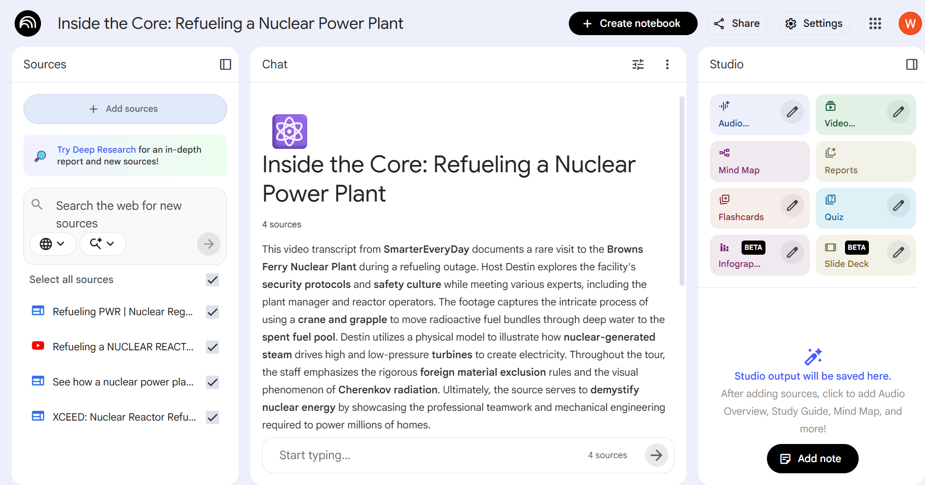
Here's the repeatable workflow you can use starting today. I’m going to use this YouTube video from SmarterEveryDay (great channel if you haven’t checked it out yet) and break it down.
Step 1: Prepare Your Source Content
NotebookLM needs something to work with. That could be:
A podcast or YouTube transcript
A PDF (book, white paper, case study)
Meeting notes or call transcripts
An SOP or internal document
A Google Sheet (like customer testimonials)
Text you copy-paste from anywhere
Go to notebooklm.google.com and click "Create new notebook."
Step 2: Upload Your Content
Click "Add sources" and choose your format:

Paste text – Drop in a transcript, article, or document
Upload file – PDFs, Word docs, etc.
YouTube link – Paste any YouTube URL and NotebookLM auto-extracts the transcript
Google Drive – Connect your Drive to pull Docs, Sheets, or Slides
NotebookLM will analyze it instantly and give you a summary on the left panel.
Pro tip: If you have multiple sources (e.g., a podcast and research articles), you can load them all and check which ones you want included in your infographic.
Still, keep adding that value!
Step 3: (Optional) Narrow Your Focus
I take the YouTube video, but only want an infographic on one topic.

Here's how:
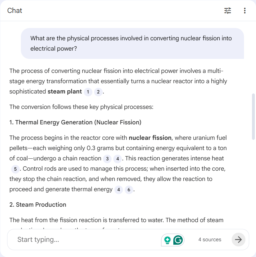
Ask NotebookLM a specific question (e.g., "What is the process of converting nuclear fission into electrical energy?")
Save that response as a note
Convert that note into a source
Uncheck your original podcast source
Now your infographic will only pull from that specific insight
This is how you create laser-focused visuals instead of generic summaries.
Step 4: Open the Infographic Generator
On the right-hand panel, click "Infographic."
You'll see:
A quick-generate button (if you want to move fast)
An edit/pencil icon to customize settings (this is where the magic happens)
Click the pencil icon.
Step 5: Set Your Basic Options

Choose:
Language – Match your audience
Orientation – Landscape (for decks/websites), portrait (for social), or square (LinkedIn/Instagram)
Level of detail:
Concise – Minimal text, easy to skim
Standard – Balanced
Detailed – More explanation (great for frameworks, books, SOPs)
Step 6: Write a Strong Custom Prompt
This is where people fail. They type "create an infographic" and wonder why the output is mediocre.
Your prompt is a creative brief. Treat it like you're hiring a designer.
Here's the formula that works:
"Create a [type of infographic] that [specific goal]. Use a [vibe/style] with [brand colors]. [Additional instructions]."
Real examples from the pros:
"Create a summary infographic that highlights the top 5 key insights from this podcast. Use a bold style with my brand colors (#003366, #FF6F00). Keep text concise and highly skimmable."
"Create a step-by-step checklist infographic for this SOP that my team can reference quickly. Ensure all steps are included. Use a clean, professional look with brand colors (#1A1A1A, #00C9A7)."
"Create an infographic showing what customers are saying about my program based on testimonials in this source. Group testimonials into clear categories like time savings, revenue growth, and community. Give it a bold and powerful vibe with brand colors (#2C3E50, #E74C3C)."
The more specific you are, the better the output.
Don't just describe what you want, describe why it matters, who it's for, and how it should feel.
Step 7: Generate and Review
Click "Generate."
NotebookLM will:
Read your selected sources
Apply your language, layout, and detail settings
Render a full infographic using Google's Gemini image generation (including the latest model, which nails text rendering)
When it's done, review it for:
Spelling and accuracy (the video showed one minor typo that needed fixing)
Content alignment (Does it match your source material?)
Visual clarity (Is it easy to read and understand?)
If something's off, don't start over. Refine your prompt and regenerate.
Here’s the Output

Step 8: Refine Using Prompt History
NotebookLM saves every prompt you use.
Click the "Show prompt" button next to your infographic, copy the text, then:
Click the pencil icon again
Paste your old prompt
Tweak it (e.g., "Make it 30% shorter," "Add a question at the end," "Change the tone to more conversational")
Regenerate
This is how you create multiple versions, one detailed for your website, one concise for social media, without starting from scratch.
Step 9: Download and Deploy
Once you're happy with it, click Download.
Now use it in:
Podcast/YouTube show notes – Give listeners a visual recap
Sales decks and proposals – Replace walls of text with visual summaries
LinkedIn posts – Stop the scroll with high-quality visuals
Internal wikis or Slack channels – Turn SOPs into team cheat sheets
Course dashboards or membership sites – Summarize calls, frameworks, and lessons visually
Quick Reference Checklist
Use this every time you create an infographic:
Go to NotebookLM → New notebook
Click Add sources → Upload your content
(Optional) Check only the sources you want used
Click Infographic → Edit/pencil icon
Set language, orientation, detail level
Write a specific custom prompt (type, goal, audience, vibe, brand colors)
Click Generate → Review
Refine prompt if needed → Regenerate
Download → Deploy
Action item for this week
Pick one piece of content you've already created, a podcast, a video, a document, or an SOP, and turn it into an infographic using the 9-step process above.
Compare the engagement. The difference will tell you everything.
Stop creating content people ignore. Start creating visuals that they share.
What the Internet Taught Me This Week
From new tools, recent trends, and market updates, here is what has been on my mind.
Artificial intelligence begins prescribing medications in Utah. Check it out here
AI to drive 165% increase in data center power demand by 2030. Check it out here
Virginia data centers consume 25% of state's energy, official says. Check it out here
Your content is only as valuable as it is consumable.
Infographics don't just make your work look better, they make it work better. They increase engagement, improve retention, and drive conversions.
NotebookLM just handed you a professional design team for free. No subscriptions. No learning curve. No excuses.
Your competitors are still sending PDFs and hoping people read them. You're about to send visuals they can't ignore.
See you next week.
Whenever You're Ready, Here are 4 Ways I Can Help You:
Unlocking Hidden Potential - Reconnecting with Past Clients for Explosive Growth - Check out my free eBook on how you can find hidden gems in your past clients and help you crush your sales goals.
AI for Business Development - Download our free eBook on how you can effectively leverage AI prompts to your advantage. From properly setting up your preferred AI tool, to how to shape your prompts, save time, and get the outputs you are looking for.
Sales Resources at Your Fingertips - From tools, tips, demos, and how-tos, check out our Pages and content that can provide you with additional support, whether it be social selling, account management, or something else.
Cribworks Advisor Program - Want more than just resources? Reach out to me and see if our Advisor Program can help you scale your business.


